Horror movie posters hold a unique place in film culture. They serve as the first glimpse into a chilling world filled with suspense and terror. A well-crafted poster can evoke fear, intrigue, or curiosity long before the credits roll. From the eerie colors to striking images, these visuals are designed not just to promote but also to resonate deeply with audiences.
Have you ever found yourself drawn to a poster that sent shivers down your spine? Or perhaps one that made your heart race in anticipation? Each element is meticulously chosen to create an unforgettable impression. Join us as we dive deep into what makes horror movie posters iconic and explore some of the most memorable examples from cinematic history. Whether you’re a die-hard fan or simply curious about design, there’s something fascinating about how these artworks capture our darkest fears and desires.
The Elements of a Memorable Poster
Color sets the mood. It can evoke fear, dread, or unease before you even see the film. Dark shades and stark contrasts often dominate horror movie posters, creating an atmosphere that pulls viewers in.
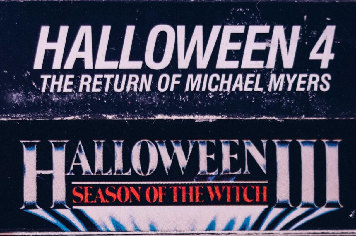
Typography matters too. The font choice plays a crucial role in conveying the tone of the movie. Jagged edges or distorted letters suggest chaos and terror, while clean fonts might hint at something more psychological.
Imagery is where creativity shines. Iconic symbols—like masks or haunting figures—are instantly recognizable and stir curiosity. They tell a story without revealing too much.
Every element must work together. When color, typography, and imagery align flawlessly, they form an unforgettable poster that captures attention and lingers in memory long after it’s seen. This perfect balance is what makes horror movie posters truly iconic.
A. Color Palette
Color palettes in horror movie posters play a crucial role in setting the tone. Dark, moody colors often evoke feelings of dread. Think deep reds and blacks that signal violence or danger.
Bright hues can also be striking. A splash of neon green or blood-red can grab attention instantly. These colors create a stark contrast against darker backgrounds, drawing viewers into the chaos depicted.
The choice of color isn’t random; it reflects the film’s themes and emotions. For instance, muted tones might suggest psychological horror, while vibrant splashes hint at slasher elements.
Colors like purple may convey mystery and the supernatural. They wrap around characters or scenes to enhance their eerie presence.
An effective color palette not only captivates but also immerses audiences into the world they’re about to enter. It serves as a visual cue for what lies ahead within those chilling frames.
B. Typography
Typography plays a crucial role in the world of horror movie posters. The right font can evoke emotions, set the tone, and grab attention instantly.
Consider how bold letters can scream urgency or terror. They draw viewers in, making them curious about what lurks within the film’s narrative.
The choice of typeface also carries significance. Jagged edges might suggest danger, while smooth curves could hint at something more sinister beneath a calm facade.
Placement is equally important. Text that overlaps with imagery creates suspense by intertwining titles with haunting visuals. It tells potential audiences that there’s more than meets the eye.
Color choices enhance typography too; stark contrasts elevate legibility while adding to the eerie vibe. Think blood red against black—it’s hard to ignore and impossible to forget in this genre’s context.
C. Imagery
Imagery plays a pivotal role in horror movie posters, often serving as the first glimpse into the film’s dark world. Striking visuals can invoke feelings of dread or curiosity and set the tone before audiences even step inside a theater.
Consider using unsettling imagery that hints at deeper themes. An innocent object twisted to create unease captures attention effectively. Shadows, silhouettes, and distorted figures can evoke fear without showing too much.
The choice of characters also matters greatly. A haunting face or an ominous presence draws viewers in, making them wonder about its story. Every detail counts; from blood splatter to eerie landscapes, each element adds layers to the narrative.
This clever use of visual storytelling invites viewers to explore what lies beneath the surface—enticing them with both fear and intrigue about what they might encounter on-screen.
Examples of Iconic Horror Movie Posters
The Exorcist (1973) set the bar high for horror movie posters. Its chilling image of a possessed girl, framed by shadowy darkness, instantly evokes fear and intrigue. The simplicity adds to its effectiveness, leaving viewers haunted long after they’ve seen it.
Halloween (1978) is another classic that captures pure terror. The stark white background contrasts sharply with Michael Myers’ ominous mask. It’s minimalist yet striking, making it impossible to forget.
A Nightmare on Elm Street (1984) introduced Freddy Krueger in an unforgettable way. The poster features his razor-sharp glove against a backdrop of eerie dreams, hinting at the nightmares within.
Then there’s The Silence of the Lambs (1991). This poster’s iconic imagery showcases Jodie Foster’s intense gaze paired with Hannibal Lecter’s infamous muzzle mask. It invites curiosity while instilling dread, perfectly encapsulating its psychological horror theme.
A. The Exorcist (1973)
The Exorcist (1973) is a cornerstone in horror cinema, not just for its chilling narrative but also for its striking poster design. The image captures the essence of dread, featuring a darkened silhouette against an ominous backdrop.
The simple yet haunting portrayal of Regan’s possessed character invites viewers into a world where innocence meets unspeakable evil. The stark contrast between light and shadow amplifies the terror looming within.
Typography plays a crucial role too. Bold letters scream urgency while evoking unease, perfectly aligning with the film’s themes. Each element works harmoniously to stimulate curiosity and fear simultaneously.
This combination of visual elements has etched itself into pop culture history, making it one of the most recognizable horror movie posters ever created. Fans often find themselves captivated by its ability to evoke emotions before even watching the film.
B. Halloween (1978)
Halloween (1978) stands as a cornerstone of horror cinema, and its poster reflects the chilling essence of the film. The stark orange background immediately grabs attention, evoking feelings of dread and anticipation.
At the center lies a simple yet haunting image of a masked figure. Michael Myers’ white mask is unsettlingly blank, embodying pure malice. This anonymity taps into our primal fears, making it an unforgettable visual.
The typography is equally striking. Bold and jagged letters announce “Halloween” in a way that feels both ominous and urgent. Each letter exudes tension, hinting at the terror lurking within.
This poster doesn’t just promote a movie; it encapsulates fear itself. It invites viewers to delve into a world where safety is shattered by an unstoppable force on Halloween night. Its design has influenced countless posters since, proving its lasting impact on horror aesthetics.
C. A Nightmare on Elm Street (1984)
A Nightmare on Elm Street (1984) is a cornerstone of horror cinema, and its poster perfectly encapsulates the film’s chilling essence. The haunting image of Freddy Krueger’s gloved hand slicing through the night sky evokes an immediate sense of dread.
The use of stark red and black creates a striking contrast that draws viewers in while signaling danger. It hints at bloodshed without revealing too much, which piques curiosity.
Typography plays a crucial role as well; the jagged font mimics Freddy’s persona—sharp, menacing, and unforgettable. This choice enhances the overall feeling of unease.
Imagery featuring dream elements cleverly intertwines reality with nightmare realms. By showcasing Freddy emerging from shadows, the poster invites audiences to confront their deepest fears about sleep itself.
With such careful design choices, this iconic artwork not only promotes the film but also leaves an indelible mark on horror movie culture.
D. The Silence of the Lambs (1991)
“The Silence of the Lambs” (1991) stands as a benchmark in horror movie posters. The design features an intense close-up of Anthony Hopkins’ Hannibal Lecter, his piercing gaze captivating audiences.
The stark contrast between darkness and light highlights the chilling nature of the character. This use of shadow creates an ominous atmosphere, compelling viewers to engage with its sinister undertones.
Typography plays a crucial role here too. The title is bold yet understated, drawing attention without overwhelming the viewer. It effectively sets up expectations for psychological tension rather than typical slasher fare.
Furthermore, the inclusion of Jodie Foster’s Clarice Starling silhouette subtly hints at her central role in this cat-and-mouse chase. Every detail serves to intrigue potential viewers while eliciting curiosity about what lies within this gripping narrative.
Evolution of Horror Movie Posters
The landscape of horror movie posters has transformed significantly over the decades. Initially, these posters relied heavily on hand-drawn artwork and painted images to evoke fear and intrigue. Iconic elements such as strong colors and striking imagery were essential in capturing audience attention before the film’s release.
As technology advanced, so did design techniques. The rise of digital art introduced new possibilities for creating eye-catching visuals that could convey a story or theme with greater depth. This shift allowed artists to experiment with 3D graphics and photo manipulation, leading to increasingly complex designs.
Despite these changes, certain timeless principles remain at play. Modern horror movie posters still prioritize bold color palettes and captivating typography while pushing boundaries in creativity. They strive not just for shock value but also for emotional resonance—connecting viewers with the themes explored within each film.
In recent years, there has been a resurgence of minimalist poster designs that embrace simplicity while maintaining an aura of suspense and mystery. These contemporary creations often rely on subtlety rather than overt gore or terror to pique interest.
Horror movie posters continue to evolve alongside changing cultural contexts and technological advancements, yet their core purpose remains unchanged: to ignite curiosity about what lies beneath the surface of fear itself.


